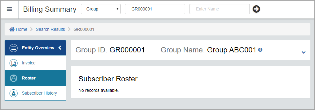
Page Design

Cards With & Without Ellipses: Instructions for when to have cards with or without Ellipses.
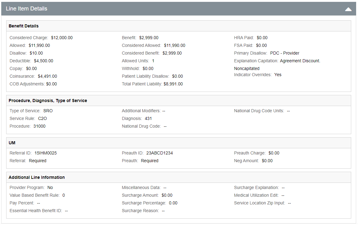
Page Card: Common Info

Click to View a Sample Page Tile: Member Demographic Info.

 
Page Card: Common Info Split

Click to View a Sample Page Tile: Member Coverage Info

     
Page Card: Common Info with Icons

Click to View a Sample Page Tile: Addresses.

 
Page Card: Common Info with Icons

Click to View a Sample Page Tile: Addresses.


Card
Card is a component to visually group related information and controls.

Landing page with Dropdown component

Click to View a sample Page of landing page with dropdown component


Table Grid with Selectable Rows

Click to View a Sample of a Table Grid.

Note:
1. The padding between the action buttons in the grid header should be 10px.
2. The empty cells should be blank.


Table Grid with Flow

Click to View a Sample of Table Grid with Selected Row.


No Data/Record Available

Click to View a Sample of No record available in Subscriber Roster.


No Record Available in Search Result

Click to View a Sample of No record available in the Search Result grid.


Line Item Details

Click to View a Sample of the Line Item Details featuring the Accordion.
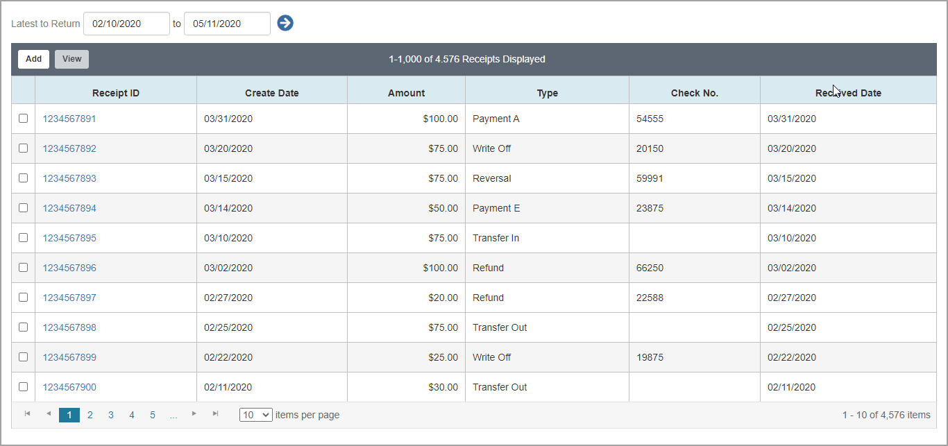
 
NetworXPricer Details

Click to View a Sample NetworXPricer Details.


Editable Grid

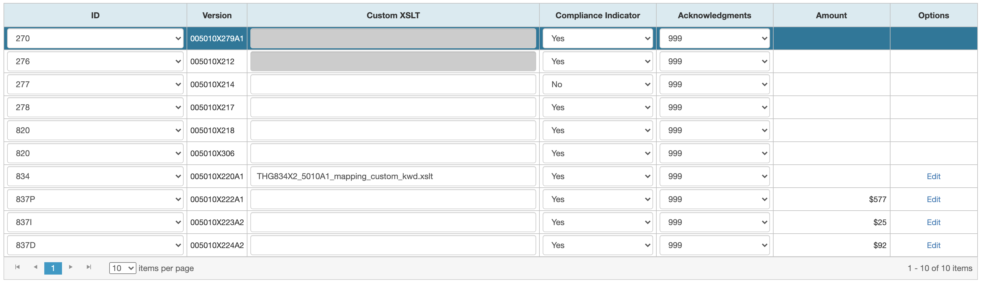
Click to View a Sample of a Editable Grid.

Note: In the grid cells, 1.The values except the amount should be left-aligned., 2.The amount should be right-aligned., 3.Hyperlink should be center aligned.


Stepper Control

Click to View a Sample of a Stepper Control

Note:


If you need help, please e-mail the PX Team or send us a message on Microsoft Teams.