HTML Elements

Pop Hover
This is just a test: 01 - Accepted; Awaiting batch  

Top Section

View a Sample ITS Top Section

View a Sample Billing Top Section

View a Sample Billing Top Section Expanded


Labels
Horizontally Aligned
Labels should be right aligned. The space between the label and text field should be 10px. The space between the label and value should be 5px.
Label   * Mandatory Field
Label:Data Field   * Mandatory Field:Data Field  
 
Vertically Stacked
Labels should be top-left aligned. The space between the label and text field should be 5px.
Label   Mandatory Field *

Note: The horizontal placement of the asterisks for mandatory fields. When horizontally aligned, the red asterisk is before the Label. When vertically stacked, the red asterisk is after the Label.


Status Labels
Status Description Font Color Status Description Contrast Test (WCAG AA)
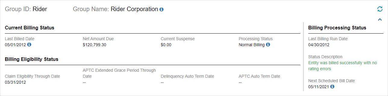
Entity was billed successfully with no rating errors #28A745 Success texts Pass
Entity was processed and suffered one or more rating errors. #DC3545 Error texts Pass
Entity was processed and these are warning texts. #D14800 Warning texts Pass

Data Display (Left Label, Right Data)

Click to View a Sample of a Data Display (Left Label, Right Data).


Buttons
Primary:   Secondary:
     
Warning
  
Danger


Tabs

 
Text Boxes
Text Box (Normal)   Text Box (Disabled)   Number Text Field   Money Text Field    Date Field 


Text Area
Text Area (Normal)   Text Area (Disabled)
 

Drop Downs     Icons
Dropdown (Normal)   Dropdown (Normal - Group)   Dropdown (Disabled)   Selected   Unselected


Radio Buttons       Check Boxes        
Radio Button Selected   Radio Button Unselected   Checkbox Selected   Checkbox Unselected   Checkbox Disabled  
Radio   Radio   Checkbox   Checkbox   Checkbox    

Dropdown Buttons
 

Grouped Button Inquiry Label 
Split Buttons


Left menu for scrolling
This UI element will be used for the long scrollable page to avoid scrolling. This is also an alternate version for black floater when it comes to many sections.

  Card Card is a component to visually group related information and controls.

If you need help, please e-mail the PX Team or send us a message on Microsoft Teams.